I created a few back ground tests of a dance studio in pencil
 |
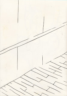
| A ballet barre and mirror with wooden floor angle view |
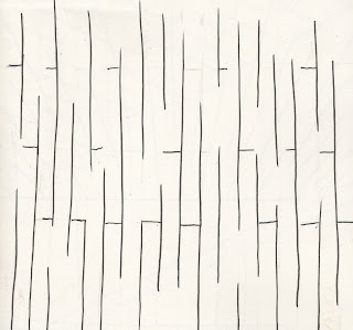
I started with just plain pencil drawings of a ballet studio, taking into account the type of angles I will need for my film.
 |
| A ballet barre and mirror with wooden floor, head on view |
 | |||||
| birds eye view of wooden floor |
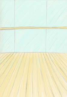 Digital Colouring Tests
Next, I scanned my drawings into Photoshop and darkened the pencil lines. I went onto create a layer beneath the pencil lines and with a coloured brush with the opacity turned up I coloured the backgrounds with soft pastel colours.
I really like how these turned out but will have to see if they will suit the drawing style that I have chosen to use for my film
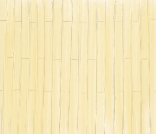
Chalk Pastel Tests
For my chalk pastel tests I made them by again darkening the original pencil drawings and then creating a layer beneath them where I placed a scanned in piece of paper which I had a block of colour created with chalk pastels.
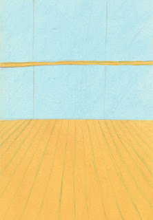
I originally wanted to use this colour test for my final film but upon scanning in the chalk I discovered that the pigments in the chalk are brought out too much during scanning and are too blunt for the style that I would like.
 |
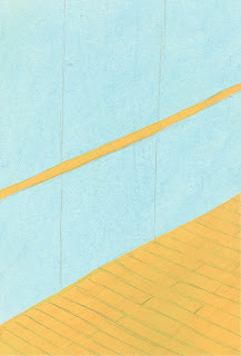
Inked versions of my Pencil Sketches
Next I inked them in a fine line marker and omitted certain parts of the lines as I wanted a hint of a background rather than a perfect depiction of them. I wanted a hint of the background as the backgrounds aren't a defining part of my story, the movement of the dancer and her journey is the integral part and I didn't want to distract from that.
Inked Versions of my Pencil Sketches With Digital Colouring
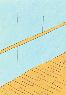
I tested how my inked versions would look with my colour tests are here is the result of the digitally coloured version. I still like the softness of the digital colour but feel that with the inked lines it looks incredibly cartoon like and feel that it is not the right look for my film
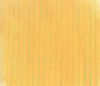
Chalk Pastel Version of my Inked Drawings
I still feel like the colour for the chalk is too vivid and will abandon using chalk in the future unless there is a way to tone down the hue in photoshop. I believe that it appears too cartoon like and will not fit in with my final film.



No comments:
Post a Comment